.
Research

The BFI Film Festival programme front cover uses a heavy amount of key conventions of covers. It uses vivid, eye catching colours to make it pleasent to draw the readers to the cover. The use of the title being delibratley placed right at the center breaks conventions and makes the bold lettering more eye catching. The soft colours of the photograph placed behind the letter indicates what is to expect inside the magazine. The magazine lacks a slogan which omits with the conventions setting itself aside from other magazine covers. This appeals to the those who want souley want to focus on film instead of the entertainment, these sort of things can draw the readers away from film.
2.
The use of irregular shapes within the background allowing a tone of sleekness throughout the programme.

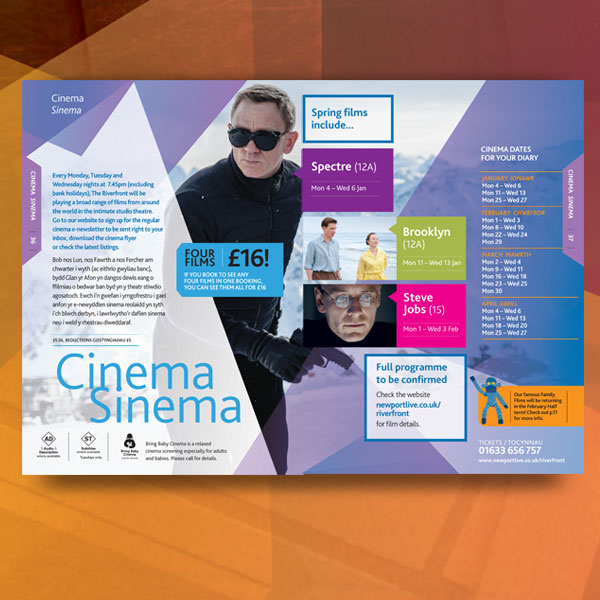
The film strip used here allows the readers to have a clear understanding of the contents within the programme setting a ground interest.

The portrait of a specific person here allows the readers to be drawn into the contents especially with the title blending in with the photography.

This cover has high level of vibrant colours surrounding the page, highlighting the sub sections of each topic within the programme.
The cover uses mosaic to capture each sub section of the programme,separating the articles and images however while successfully highlighting the main target audience.
3.

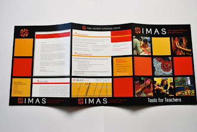
The combination of image and text successful in drawing the readers to what is important such as the use of colour to contrast the importance of the heart. The lettering of the title.
The use of the certain images to support the content on the right. It is stacked giving it a neater look.

The way the content page is neatly divided into text and pictures. The use of sub headings to divide categories is clever. This is a very neat content page.

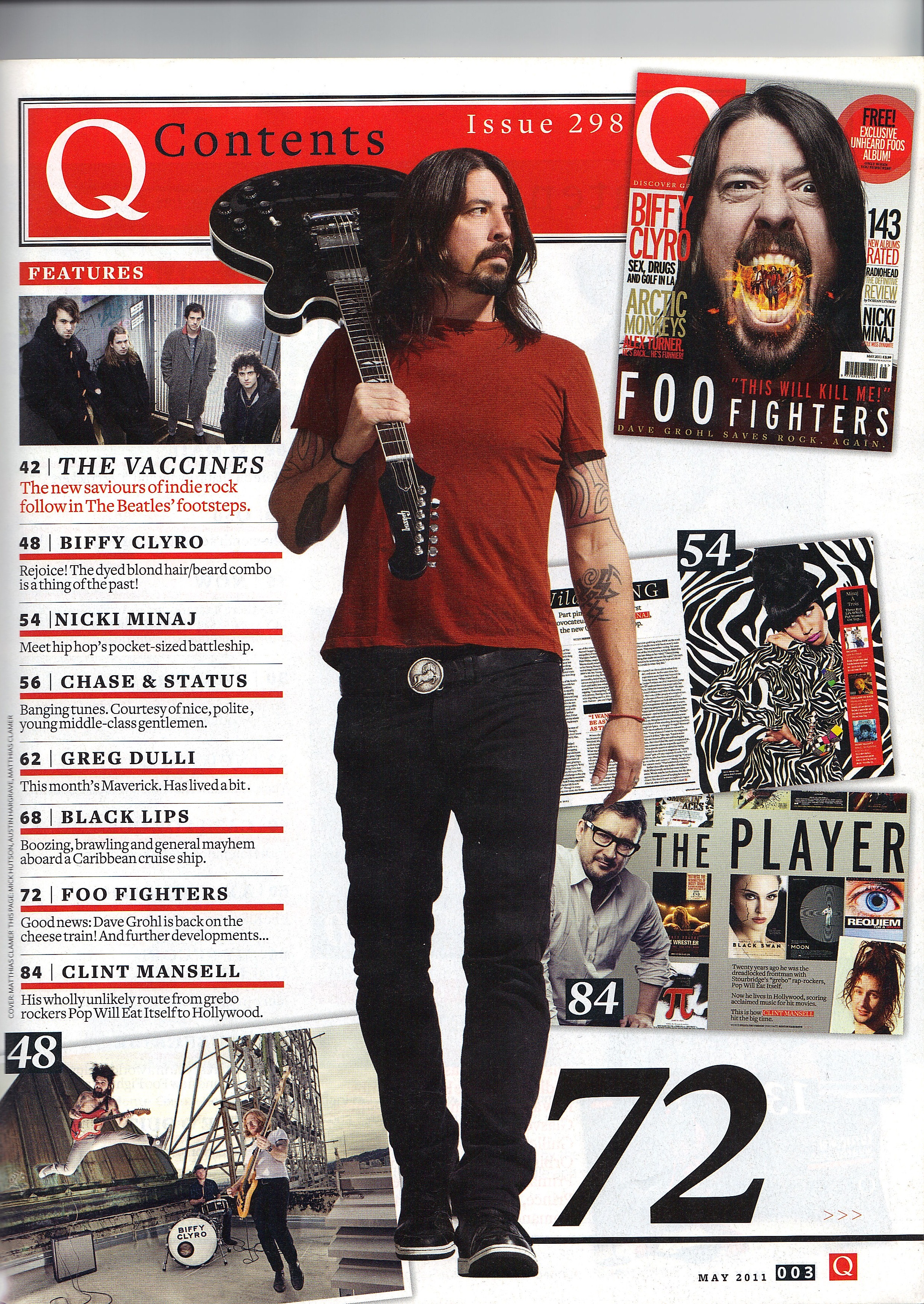
This specific page has the main imagery covering the lettering of the title to suggest how the can still figure out what the word is but more or less focusing on the image.

This bizarre contents page has it's text overlapping to create a disoriented tone, the text is also written across the page but not the same way the pictures are faced.
Planning and sketching
The main target audience would be interested in urban gritty films, truth selling stories, exclusive content.
My double page spread will consist of the two main characters and some text behind the scenes and the original story, allowing many readers to be able to relate. This allows readers to be fully engaged within the print to create emphasis.


Photoshoot
Pratisha ( Aisha) and Nasteha ( Noora) will appear on the front cover of the programme.
We will be needing sharp cutting images, to catch the audience eye and wonder.
Two characters facing back to face, the levels different to create highary and Aisha's face facing the camera but distorted image of it.
There will be a MCU, ES, ECU and MS of both character for the front cover and a MS and LS for the double page spread.
Black hoodies and bottoms for Aisha and bright colours to stand out for Noora. No props needed as we would like to minimum to create a full visual effect.
No comments:
Post a Comment